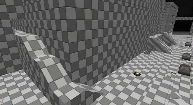
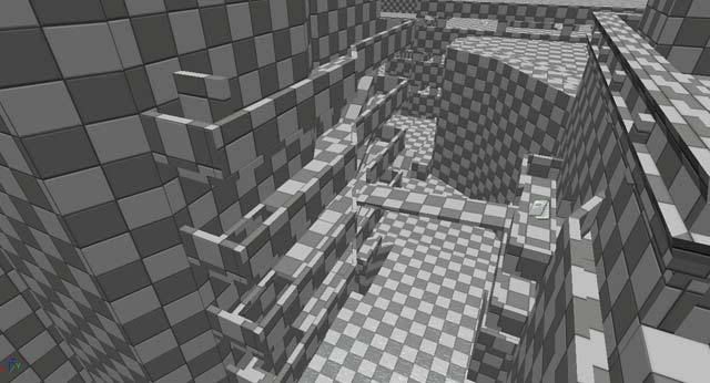
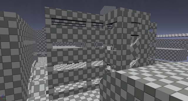
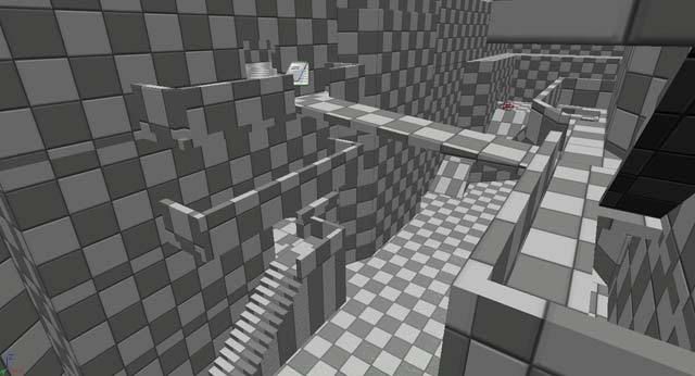
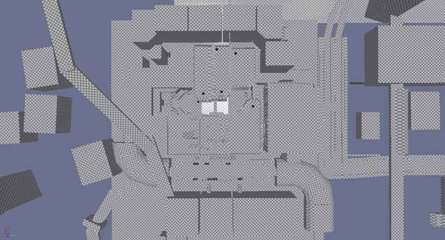
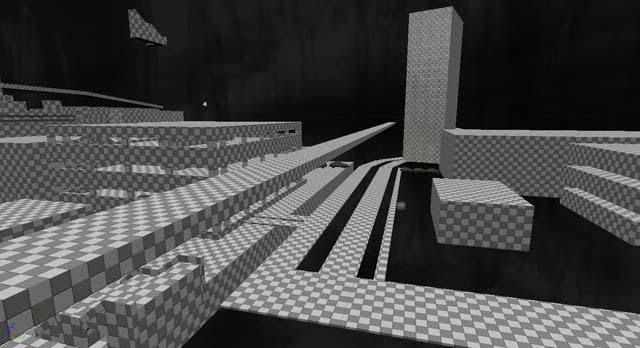
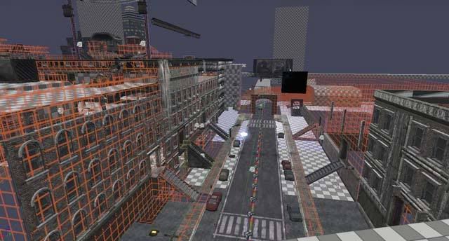
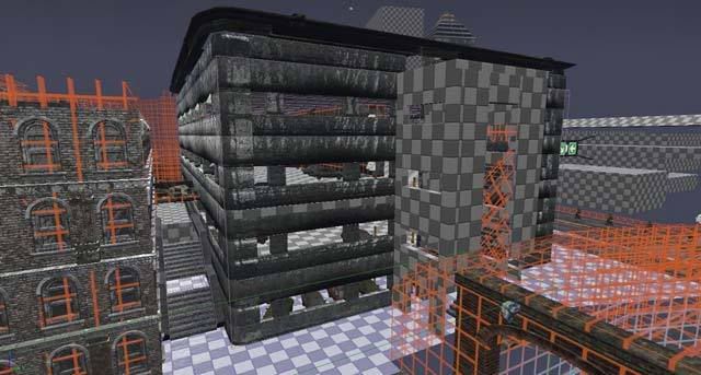
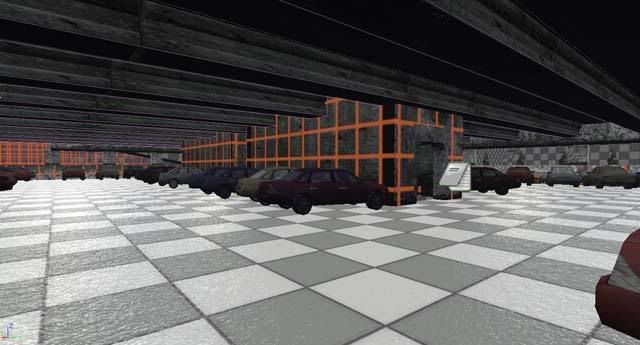
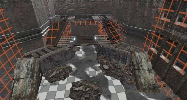
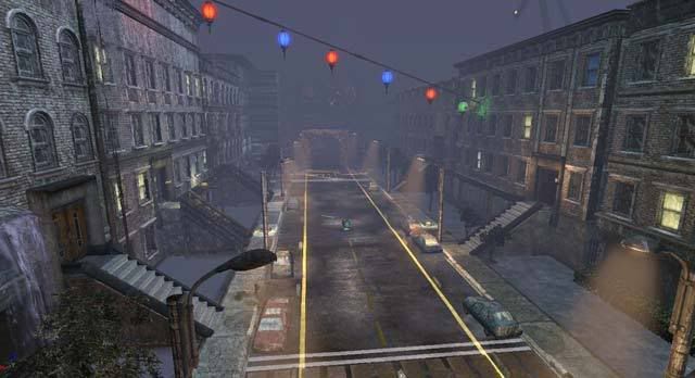
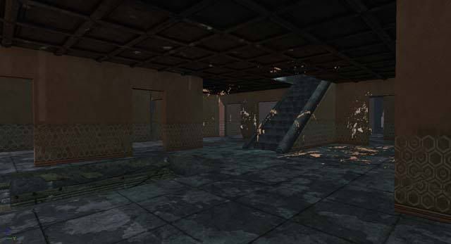
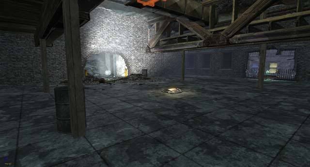
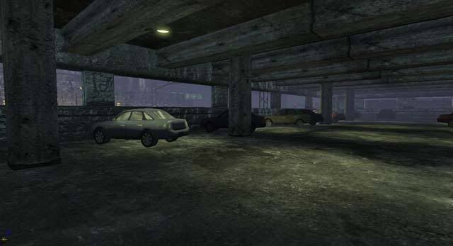
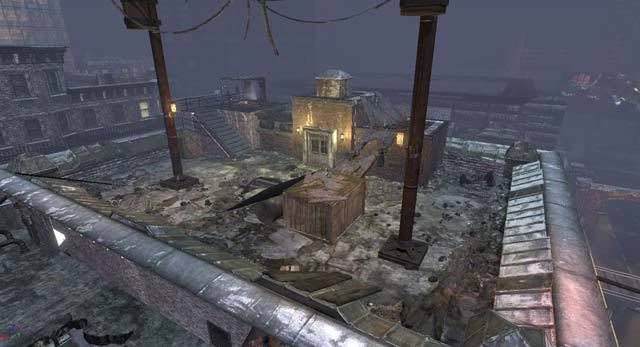
Wow! Long time without updating but not long since I've been working: everyday I have been pouring more work into this level. I had set a pretty tight deadline on myself when I started this new project (which I calculated from the amount of time it took to complete the last level). Seeing how this level is exceptionally larger and more detailed, I have already passed the deadline by a week.
Here is a quick overview of what I've accomplished:
8/28 - Started adding sound
8/23 - Scratched the surface of adding pickups. Decided to save for once other areas were complete (I was still adding extra entrances in an out of areas)
8/25 - Found out that lightmaps severly increase file size. Too many unnoticeable meshes were being lightmapped or had too high of a resolution. I decided to limit lightmapping mostly to objects that had lighting hitting them. Objects that had silhouettes cast from other objects have the highest resolution.
8/27 - Added extra side entrances into garage, built a huge cull distance volume that covered the entire map, added post processing
8/28 - Added animated ground fog planes, finalized boundaries (which were kept at unlit BSP for the longest time), found out that when multiple players were added the current car system would only kill the player (not npcs) -- had to fix in Kismet
Current work that needs to be done:
- Find any holes or descrepancies in blocking volumes or static meshes
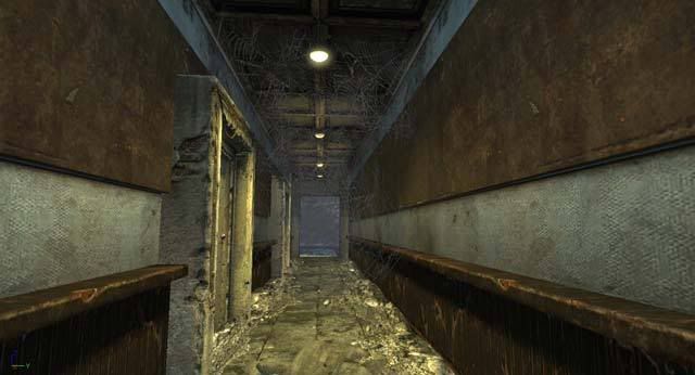
- Finish refining the interior of the main building, while making it more open all around
- Continue to optimize lightmap resolutions. Current file size = 90MB, desired file size = 50 - 70 MB
- Add pickups and balance player flow
- Finish scripting any additional cool features
- Surround level with kill volumes
- Add rain static mesh
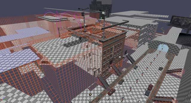
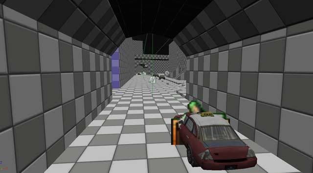
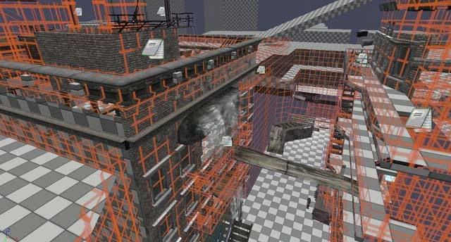
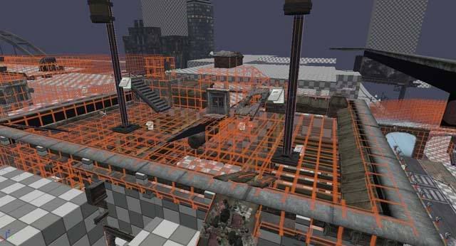
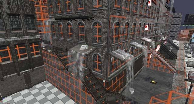
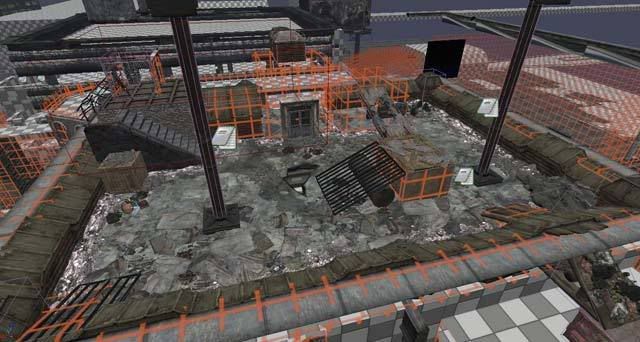
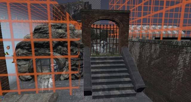
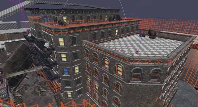
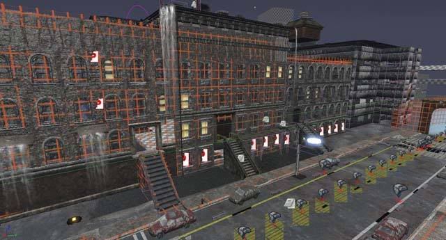
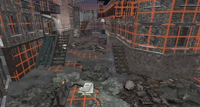
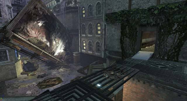
I'll give myself another week to finish. For now, here are some screens of my current progress:
Thursday, August 28, 2008
Thursday, August 21, 2008
Level Update
I've been experimenting lately with lightmapping meshes. By default, Unreal has every static mesh defaulted to override to a lightmap resolution of zero -- which isn't good for shadows cast by other meshes. I've been trying to push the lightmap value at a pretty high amount (usually 128-256 for each mesh), and leave meshes that are farther away or not seen by the player with no lightmapping. A good rule of thumb I've developed is to use a higher resolution on horizontal surfaces that will be walked on by the player and have more shadows and lights hitting them overall. For vertical surfaces, such as walls, I try to use a lower lightmap value (the exception to this is if there is a hanging wall light that is casting a dominant shadow).
Another fun aspect I've begun today is adding sound. I actually knew very little about sound for my last level, but managed to mix and match different ones in certain areas to get the right feel. Now, I'm more comfortable mixing custom sounds with the sound editor that have a much better result. For instance, I made a randomly generated thunder sound that randomly pairs with another thunder sound -- so there is always two thunder noises at once. This adds a lot more depth and the randomness is for realism. Once I add a new element it always inspires me to add another, so I will most likely have flashing lights to simulate lightning that will be synchronized with each thunder noise.
There was a sound that I've been meaning to add for a while and finally got to it today: the sweep of air and rumbling engine of a passing car. I have observed cars during the rain before, and they make a loud hissing noise from the tire tread quickly spraying water particles everywhere into a fine mist. I wasn't able to do this with a KActor, as there doesn't seem to be anyway to attach a sound to a dynamic object and have it movable. For this, the interp Actor, a.k.a "Mover" was perfect. The player now has a sound clue as to when a car is coming down the road and won't feel as cheated when one hits them from behind. I am also thinking of adding a trigger to honk at the player while they are in the street. Now I have to focus on adding a little more light to spice things up in darker areas, fill any gaps I probably have overlooked with static mesh, add decals for variation on larger surfaces, and add small amount of particle emitters (in which I presently have the least knowledge of).
I have marked item pickups with notes and am not too concerned with them at the moment. I have a pretty clear idea in my head where each will work best, and as the level has been changing gradually as I began to add more detail, logically it would be best to hold off on any placements at this time. Player flow and aesthetics are my main focuses at the moment. The level should be done in a week from now :).
Thursday, August 14, 2008
New Level
I've been meaning to post my current progress on a city map that I've been working on for Unreal 3. I gathered a lot of my inspiration from the building in Home Alone 2 where all of the traps were set up. I really didn't have a base floorplan for this one, as I wanted everything to focus around the main building that would be multi-story. I first blocked out the building (perhaps in too much detail, as I currently I have been having to delete a lot of BSP. I then thought of a cool mechanic to act as a border: having a street with passing cars that would hit the player as they crossed the line. After play testing this multiple times, it seemed unfair that a car would fly out so fast at the trigger of the player, which was both frustrating and unrealistic. Because of this, I decided to make the cars begin moving as the level begins. It would have been repetitive to have just one type of car at the same speed and the pattern would be easily spotted by the player and thus break the immersion. For this, I developed a complicated system in kismet that randomly chooses 1 out of 4 cars that will pass by, randomly pauses in between, and each have a different speed for variation. This seems to work really well was worth the effort.
Next, I wanted to have the same effect on another part of the level to really make the city feel alive. I copy and pasted the code and altered the matinee animation so that the cars would accurately travel a long, winding road in the distance. This may have been unnecessary, since the road is not easily seen by the player, but it really adds to the depth of the area "beyond" the play field (I hope players notice this one).
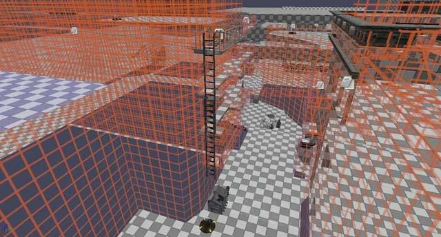
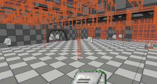
Taking inspiration from another amateur mapper's technique of building levels, I used a transparent grid texture on most of the BSP of the level (except for floors) so that I could see if walls were snapped correctly and to let me have more freedom in placing static meshes. It seems that a realistic level relies heavily on static meshes opposed to bsp these days, as opposed to older generations. Also, I've been doing a lot of research into Unreal's automatic occlusion that each Static Mesh provides. This greatly increases framerate: as a static mesh will not be drawn on screen if the player's view is blocked by another object. This does not seem to be the case with BSP.
From here, I began placing meshes and had previously came up with a water-overlay texture that I thought would be perfect in a nighttime city setting. What better for a Wow factor than water flowing on nearly every texture? This has been a long but rewarding process in learning the ins and outs of materials in Unreal. I have a better understanding of the use of instancing and how slight variations can be created in the blink of an eye.
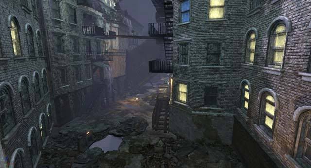
After having most of the level blocked, I noticed that there were too long of stretches in the open areas on either side of the main building. I decided to add some flare by having a huge billboard (that's main purpose is to occlude) right in the middle of the alley. I had to make it have a purpose and narrative, so I thought it would be cool if it had fallen and crashed into one of the buildings. This would cause a lot of rubble, of course, so I took account by adding mounds of debris (the other section still has a framerate drop and I'm cycling through feasible means of occluding the insane amount of static meshes in that area.
After having water flowing and static meshes placed, I still thought the level could use a little more "umph." This is when I noticed that none of the levels in unreal have lit windows. This isn't the destroyed post-apocalyptic village like in unreal: it is a living, breathing metropolitan area. I had a couple of different lights in windows that I've noticed from observing houses at night: lights go on and off in certain rooms, stay on in others, tv's flash blue erratically, and occasionally there will be a party with a flashing strobe light (I have used these sparingly, in areas that would serve as clues to guide the player).
Yesterday, I noticed one building off in the corner getting no love. I decided to pamper it, then, so I proceeded to make it an abandoned building with boards and all. I then thought it would be nifty to make it haunted, so created a script to make the windows glow red and would add a screaming voice once the player got too close. This seemed fun but a little over the top, so I made the color transition as if an explosion were being set off: either by other npc's in the distance (it is a war, after all), or by construction workers using C4 to slowly destroy parts of the building.
Here are the screens of my progress:
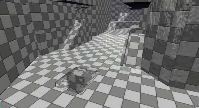
Right now I have most of the dressings of the level with mostly all of the close-encounter static meshes in place. What's next will be lighting, and sound, item placement, and bot pathing (probably in that order). This has been a bigger project than I had expected, but I like to finish the ambition that I have set for myself. The level has nearly evolved out of a mere Deathmatch, and would probably serve as a good CTF or single-player level.
Next, I wanted to have the same effect on another part of the level to really make the city feel alive. I copy and pasted the code and altered the matinee animation so that the cars would accurately travel a long, winding road in the distance. This may have been unnecessary, since the road is not easily seen by the player, but it really adds to the depth of the area "beyond" the play field (I hope players notice this one).
Taking inspiration from another amateur mapper's technique of building levels, I used a transparent grid texture on most of the BSP of the level (except for floors) so that I could see if walls were snapped correctly and to let me have more freedom in placing static meshes. It seems that a realistic level relies heavily on static meshes opposed to bsp these days, as opposed to older generations. Also, I've been doing a lot of research into Unreal's automatic occlusion that each Static Mesh provides. This greatly increases framerate: as a static mesh will not be drawn on screen if the player's view is blocked by another object. This does not seem to be the case with BSP.
From here, I began placing meshes and had previously came up with a water-overlay texture that I thought would be perfect in a nighttime city setting. What better for a Wow factor than water flowing on nearly every texture? This has been a long but rewarding process in learning the ins and outs of materials in Unreal. I have a better understanding of the use of instancing and how slight variations can be created in the blink of an eye.
After having most of the level blocked, I noticed that there were too long of stretches in the open areas on either side of the main building. I decided to add some flare by having a huge billboard (that's main purpose is to occlude) right in the middle of the alley. I had to make it have a purpose and narrative, so I thought it would be cool if it had fallen and crashed into one of the buildings. This would cause a lot of rubble, of course, so I took account by adding mounds of debris (the other section still has a framerate drop and I'm cycling through feasible means of occluding the insane amount of static meshes in that area.
After having water flowing and static meshes placed, I still thought the level could use a little more "umph." This is when I noticed that none of the levels in unreal have lit windows. This isn't the destroyed post-apocalyptic village like in unreal: it is a living, breathing metropolitan area. I had a couple of different lights in windows that I've noticed from observing houses at night: lights go on and off in certain rooms, stay on in others, tv's flash blue erratically, and occasionally there will be a party with a flashing strobe light (I have used these sparingly, in areas that would serve as clues to guide the player).
Yesterday, I noticed one building off in the corner getting no love. I decided to pamper it, then, so I proceeded to make it an abandoned building with boards and all. I then thought it would be nifty to make it haunted, so created a script to make the windows glow red and would add a screaming voice once the player got too close. This seemed fun but a little over the top, so I made the color transition as if an explosion were being set off: either by other npc's in the distance (it is a war, after all), or by construction workers using C4 to slowly destroy parts of the building.
Here are the screens of my progress:
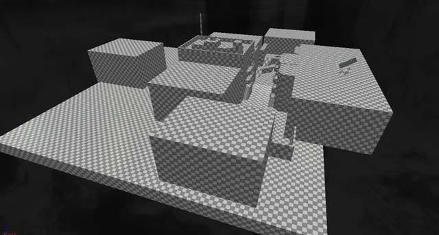
Right now I have most of the dressings of the level with mostly all of the close-encounter static meshes in place. What's next will be lighting, and sound, item placement, and bot pathing (probably in that order). This has been a bigger project than I had expected, but I like to finish the ambition that I have set for myself. The level has nearly evolved out of a mere Deathmatch, and would probably serve as a good CTF or single-player level.
Subscribe to:
Posts (Atom)